
Island Fortress – Region Boards, Wall Tiles and Score Towers
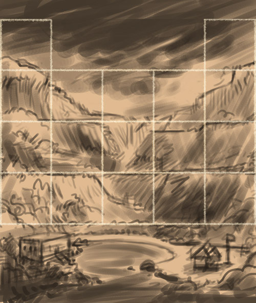
The region tiles needed to feature a wrap around tileable graphic so the boards could be placed next to each other seamlessly. The original theme of the game had been “building the great wall of china” so regions in that theme were much more vast and seperate concepts. I figured the idea of bays or coves as regions would work well with the island theme.
Early concept rough
Abstract clarity vs thematic immersion?
Another challenge was to decide how to tackle the abstract gridded block placement and the reality of building a fortress. Ultimately I tried to find a balance that kept the rich theme Bryan was hoping to capture and still acknowledged the abstraction of the game. By using the parchment backdrop, I tried to summon up the idea of an architects plan and create the expectation that this wasn’t going to be a real world fortress you are building; but by leaving the surrounds as more realistic that you could still attach meaning to the actions based on the them.
As far as the colour and tone went, I maintained the feel I had developed for the box cover.

Wall blocks
The wall blocks themselves were probably the most challenging component. In the prototype they were flat coloured sqaures and in other iterations of the game they had been rimmed with the player colours. I felt that the coloured edges made it all too abtract and broke the fort up into tetris like pattern, which worked fine for readability, but I wanted to shoot for a sense of actually building something together that was more of a integrated whole.
Bryan had asked for some kind of marking that would help colour blind players, so I suggested that maybe we just use those marks and colour them in the player colours. It would leave the edges of the tiles to jigsaw together into a larger picture (rather than be coloured). The final result still isnt a fortress, but I think it falls somewhere in the realm of satisfying both players looking at the abstract patterns and those who want to see something more pictoral.
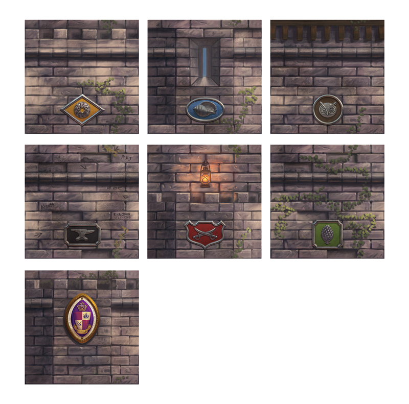
For the backs of the wall tiles we played with the idea of having a more abstract optional graphic in player colours, but opted for something that would blend with the player boards, which I’ll post in that journal entry.
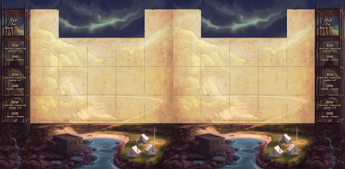
Score towers
The score towers attach to either end of the region board layout as a player aid to scoring. I felt like using a scaffold motif, even if it was entirely abstract would do well to frame the concept of the fort and resonate nicely with the use of the scaffold imagery on the cover. Scaffolding also embodies the concept of escalation, a sense of which I felt worked well with the idea of scoring higher and higher (with perhaps a rising feeling of vertigo and risk).
Next: Character art
1 Comment
Eric Martin
March 29, 2012the images look great. You guys really have gone above and beyond with this one!