
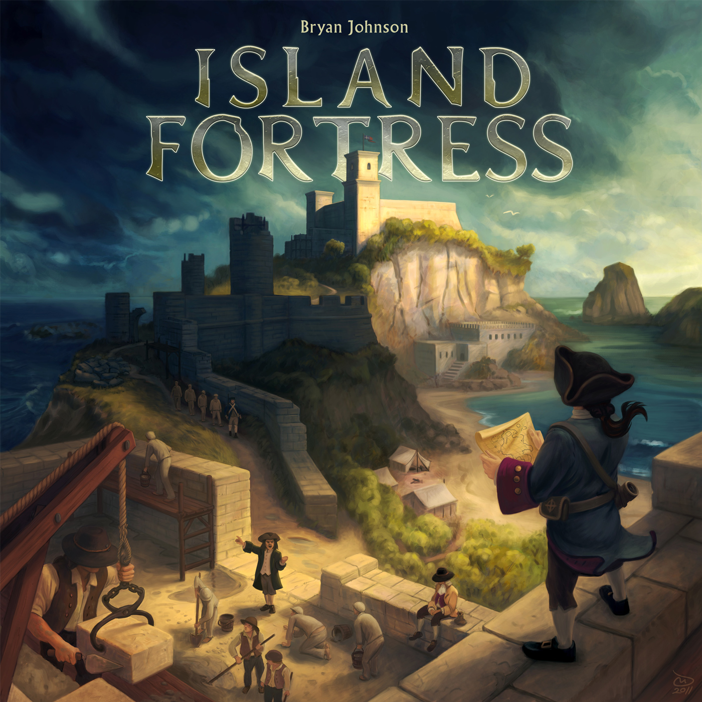
Island Fortress – Cover Development
Playing around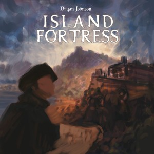
To the right is the very first sketch I made – didnt put too much conscious thought into it – just playing to get a sense of atmosphere and ideas for the composition. After some other experiments I pretty quickly decided that a pyramid based composition (as this sketch has) would work well. The solidity would not only help depict the might of the fortress, it would also give me a solid foundation to be able to have all the little details I wanted to include.
I felt the basic atmosphere and colour were an okay starting point and after some good feedback from Bryan and Dan from Game Salute I began to confidently work towards a moody yet vibrant feel. As a gamer myself I know there are some players that love colourful components and some that like things more subdued – I took it as an interesting challenge to try and please both, then I looked at a lot of art from the period and pondered…
Composition and Referencing
This part of the process involved a lot of thumbnailing and moving around of elements. I also looked at a lot of references of island forts and period dress.
I felt a sense of scale was important, so rather than having a close up character in the foreground as I had been playing with above I decided to work on making the characters smaller in the scene – to lend the sense of a more epic drama (rather than a personal or emotional one). I pondered a composition looking up, with the fortress towering above, and vice versa, almost a birdseye of the island showing the the drama of the workers. In the end I wanted both feelings so I push and pulled as best I could until I had composition that had the fortress tower looming and a view down on the work from above.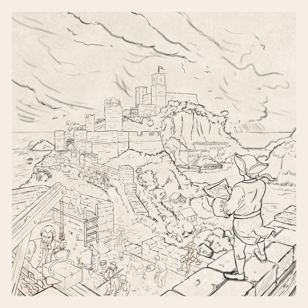
A pyramid is a very solid feeling composition – and a down pointing pyramid feels very unstable and puts you on edge. This idea came back to me as I was working to position the Taskmaster in the painting (who I knew would need to be a focus of the painting). So I set him at the base of an upturned pyramid of sorts to try and provide a little unnerving counterpoint to the solidity of the fort tower.
You can see the builder’s face is seen in this pencil layout – we decided to remove it so we could be consistent with the card art should any kickstarter backer decide to take that level.
Lighting Studies
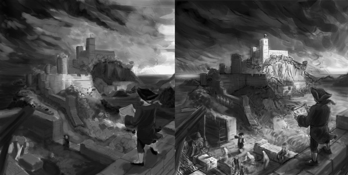
Getting the tones and lighting to work was the next step, something I’d usually do as a very first step in the process as small thumbnails. I’d left off on it this time as I really needed to get a clear idea of the shape of the setting and the objects in it first… but I had been thinking about the lighting a fair bit as I did the pencils and the very first concept seemed to suggest a solution – with the tower silhouetted against a pale horizon.
I did some block in tests with the back tower dark and the mid tower lit in highlight, but it just wasn’t working and I gave up on it pretty quickly. There are three grounds to the composition and I felt that if I had the middle tower light I’d need the foreground dark, which wasn’t going to work. On the left is the initial tonal concept and to the right is the tonal rough that cracked the lighting scheme of major darks and lights for me. Doesn’t look like much but once I had this idea in my mind I could confidently start painting. The tower became much more of a focal point and so did the taskmaster.
For a long time I was considering a very overcast lighting, with minimal shadows, as it is a good lighting model for complex scenes (you dont have shadows messing with the composition and it also shows off local colour vividly) – the problem was there wasn’t a lot of local colour in the scene to show off and I felt I needed a more dramatic lighting to tint things make it all come alive. Bryan had from the beginning wanted something overcast, brooding or stormy, so in the end I went for that moment before a storm, where I could have patches in sun and patches beneath cloud.
Painting and Colouring
Painting began with first blocking in the colours. As I was blocking in I made changes as I went, the Planner’s jacket was red for a while, but I just left his cuffs red in the end (which is actually more historically accurate) and I tried to make certain parts more dynamic. Somehow I resisted detailing anything until I was happy, then I slowly began working through section by section detailing and polishing. I left the taskmaster until last as I wanted to crescendo there. I then went back and readjusted some sections and pumped up some of the values.
Looking ahead
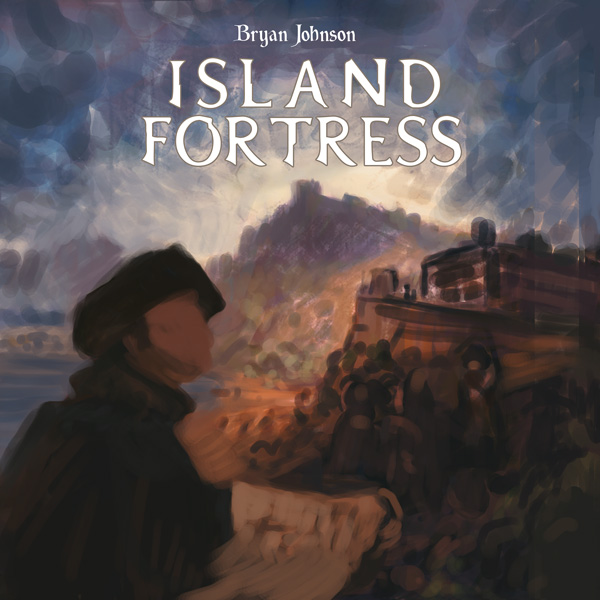
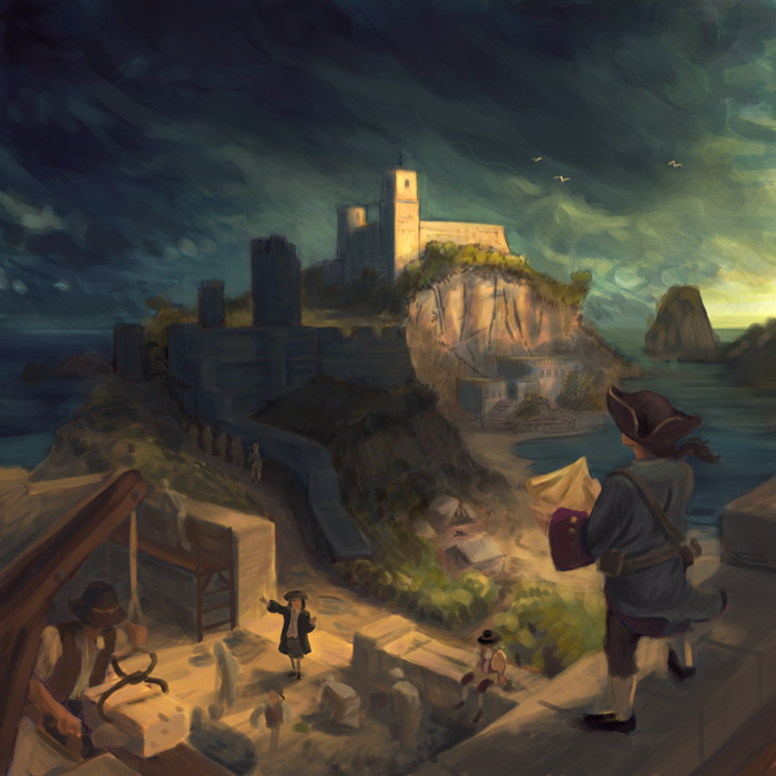
My goal was to make the art look historic and epic, but still “gamey”, like it was painted for a game – not overly realistic but atmospheric, fun and a little caricatured. The rules as I got them from Bryan were really interesting and evocative of where to take the components. I like the idea of actually capturing parts of the game in the cover image rather than just providing a generic cover that could be the cover of a book or the like. So when you look around the cover you’ll see things in the game, like the prison, the camp, the various characters and even the idea of different regions you can move to and build in.
If the game goes ahead then I’ll be making a few more minor changes to the cover I think, especially if someone backs it at the taskmaster level. I’d planned to have the Island Fortress title behind the tower from early on. The effect is to let the tones in the clouds change the tones on the letters. I’d like to touch up the title with a touch more to give it a bit more character.
The work on the cover and the research I did should hopefully stand me in good stead when approaching the other components. You can click on this image to see the final art in higher resolution.
Thanks for reading…
Next time… designing and illustrating the game tokens… which I better get back to work on!
3 Comments
Lorien
December 14, 2011Beautiful work, Dann, I really love the sort of stormy skies palette, at least it has that feel to me (that’s probably not a technical art term! 🙂
Here’s a link to the Island Fortress Kickstarter in case people want to get in on this:
http://www.kickstarter.com/projects/frostforge/island-fortress
Dann May
December 17, 2011Thanks Lorien, you know, there actually probably is an art term for that kinda palette but I don’t know it. 🙂 There was a tradition of that sort of lighting in the great landscape and historical painters of the 18th century… lots of dramatic cloudy skies. And they were also pretty big on defining their formulas and terms. Considering the theme and setting of the game it was good having those references there as inspiration before letting my imagination take hold completely.
Bryan Johnson
December 13, 2011Nice journal, Dann. It’s interesting to read about your journey with how the art came to fruition. Looking forward to reading more.