
Island Fortress – Character Art
The character art was always going to be based on real people. It was part of the brief and one of the reward levels for backing the game on Kickstarter. So right from the start I knew I needed to be painting in a style that would let me render realistic people and leave a little room for making them look just a little stylized (I think straight up realistic portraits often tend to fall flat in games).
I’ll use the taskmaster card as an example, but the same process applied to all of the character card art.
Colour choices
I decided from the get go to illustrate each character in a distinctive colour pallette. I decided this on the box cover art and then just followed it through to the cards. At this stage I did suspect that the card backs would be fairly monotonal (in player colours) but I had some plans to perhaps let a little of that colour seep through to provide a little more interest.
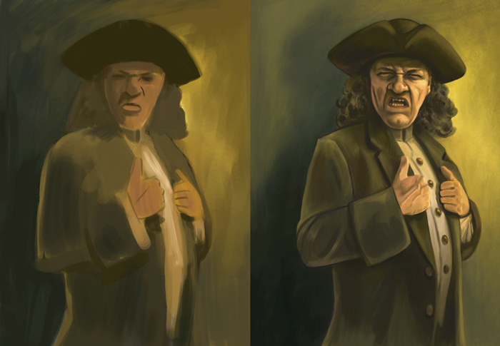
Working with reference
For the cards I started with a rough block in of the shapes. I did this before I did any drawing as I wanted to make sure that the poses/compositions would be very different for each character. Then I detailed them up based more closely on the reference material of the real people (which I won’t post as I haven’t sought their permission). The most challenging, but also the most rewarding part of working with photo reference is assimilating the person’s features, and then casting them in a completely imagined light.
I rarely, if ever, just paint a portrait directly from a reference. I like three or more images to get a sense of the features and use that sense to help me pose and light the face as I want it to be in the final artwork. For example in the taskmaster image below I blocked in the lighting based on how I wanted the composition to be – but there were no reference photos with that precise lighting. (Although I do find it better to have reference photos that do have some direct lighting – flash photography is terrible for getting a sense of form.) I’ve found that having to make the lighting up gives the work that slightly more crafted, less copied from a photo feel to it, whilst keeping it still a reimagined portrait of a real person. I think that by always asking myself to be imaginative it keeps the process alive.
 Player cards
It’s hard to see the painted colour coming through on the final artwork as it will appear in the game. But when you see the other characters and how their colour schemes work differently with the tinting I think you should be able to notice it isnt just monotone, but there are very subtle colours at play within the overall player colour. That’s the theory anyway. I hope to see the full colour images in the rulebook or on the box sides perhaps. 