Island Fortress – Tokens
Here are some of the more cogent considerations I noticed swirling around in the back of my mind as I was developing the tokens (and I’d think they’ll also apply to most of the components).
Practicality
– To be conscious of production costs, aim for minimum fiddliness and no unnecessary bits. Tokens should ideally make the game easier to play.
Legibility
– To be able to read and also see clearly what the token is communicating. This can be as simple as just being able to read the text, but can also extend to illustrative and symbolic meanings that communicate the purpose of the component in the context of the game.
Tactile aesthetics
– Boardgames are a tactile experience, its a large part of what makes them different from other games. I like the idea of it feeling different when you pick up and play different tokens. Small World is a great example of a game with irregular shaped tokens that inspire you to feel different as you play them. When you play a Troll lair its sharp corners feel more appropriate than if it had just been printed on a circle.
Contribution to atmosphere and setting
– This isn’t just about illustrating the historic setting of the game, but blending the abstract and thematic facets of the game into one pleasing experience. Island Fortress works as an abstract game and as a thematic story driven game, but there are elements and choices to be made in the components which will better meld the abstract mechanics and the feel of the storyline and setting.
Treasure Tokens
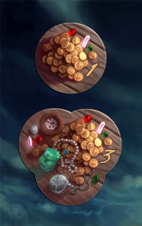
I felt like having the different value treasure tokens (1 and 3) the same size and shape but with a different number wasn’t quite right – perfect for coins, but not very illustrative of a stack of treasure. At the same time the 3 token couldn’t be so different it wasn’t immediately apparent it was a treasure token; or be so cumbersome you may as well just have 3 x 1 tokens.
We could have simply made it a slightly larger circle, but I wanted something that said “3” treasure in a more visceral and perhaps intuitive way. So I figured I’d literally merge three circle shapes into one, so it has a different (though similar) tactile feel while still being practical and an obvious variation on the 1 treasure tokens. It takes up less space than 3×1 tokens, but is larger to visually communicate its extra worth to players.

The small wooden bowl on the 3 token was originally half a coconut shell, but Bryan reminded me that the island was temperate and not tropical. I explained it could have been carried there by an African swallow, but he reminded me they were non-migratory. So I changed it to a wooden bowl. Still… you’d think two swallows could carry a coconut on a line if they held it under their dorsal guiding feathers…
Reinforcement Tokens
Using a reinforcement token blocks a wall tile from being moved by another player and is a fairly confrontational move in the game so I want picking one up to feel a lot different than picking up the other more reward based tokens.
The reinforcment tokens need to be placed on the wall block tiles; so they need to fit over them and let some details show through. Because of this I’m developing them as I develop the wall blocks and will post some pics of them when I write about those bits in a future post.
Buyback Chip

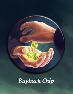
Here I used two hands in a ying-yang, recycling type pose to communicate the purpose of the chip – to return a previously used role card to your hand. In the game you can also buy back yout taskmaster card by paying three jade, so I wanted to include that on the token to relate that to the token’s purpose. I’m considering slightly modifying the shape and will make the decision with Bryan and the guys at some point before publishing.
Governer’s Seal

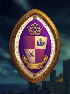
With this token Bryan suggested the oval shape (which was very appropriate as it was a common shape for seals from the time of the game) and I just set about trying to make it look like you’d want it sitting in front of you. The highest bidder gets the seal and the power that comes with it so I wanted to make it nice and golden and tempting. I added a couple of bits of jade to it as the island is so rich in it and the latin phrase, which I wanted to have something of a gamerish undertone to it. It will also be nice and large and placed on an illustrated stone stand in the final game.
Next… The Wall block tiles and the region boards…
