
Storm Hollow – The Game Board and Map
Sometime in May 2012 I was handed the prototype components, a draft of the rules and a smattering of world lore for Story Realms (now Storm Hollow). It took me a few days of reading the rules and looking through mocked up components to truly get my head around what was what, but right from the very start the charming design of the game and the world started setting off the sparks that would fire the art and design decisions that followed. I couldn’t wait to get into it.
Here is a bit of a development journal on the creation of the Rifts of Storm Hollow map.

This map is the first map I saw. Angie and Julian (the co-designers, aka Escapade games) sent me a bundle of stuff but the visual representation of their world was still very much emerging out of their stories at this point. Not long after this I received the following map, which Angie and Julian had roughed in. When compared to the final game board you’ll see now has all the rifts in basically their final positions. It actually took me a while to get my head around it all, it took a lot of reading about the rifts themselves and the stories that had been created for them to start to see what this world was wanting to become.

The main direction Escapade gave me was they wanted the map colourful and with lots of little details to pour over. At this stage there was an assumption that the map was going to be a poster map, but whilst working on ideas for the storyboard component it seemed like a good idea to merge the map and storyboard into one component – to make the most of the map art and to have the option of using it in game as a part of the tracking system in future stories. I think the basic layout of the maps Escapade had sent me probably helped to form the idea originally, as Storm Hollow was already horizontal in format, and the great desert at the bottom seemed to be the perfect way to blend into the storyboard section.
Once we’d agreed on the format and the decision to go ahead with producing the map for the Kickstarter campaign I set about reworking and solidifying the map so I could give the map artist a running start.
The first consideration was simply to fit the map into the top portion of a 22inch square game board (our standard board at Game Salute) with the story board section at the bottom; and in doing so position major features and titles so they would avoid the fold lines. The next step was to rework the general rifts shapes so they were more aesthetically pleasing and would lead your eye around in a more interesting way.
I felt that the map needed a blend of epic realism with something more innocent and childlike. So I reworked the rifts to follow more natural curving landscape forms to unite the landscape into what felt more like a real place, but at the same time I was also looking for ways to divide the rifts in some way to keep with the theme that the world is a patchwork of different realms. So I introduced features like the steamy ice river between the Everblaze and the Frostshard, the crater like divide between the Thunderdrum and the Weirding Wilds, and in particular used the central cliffs as a uniting element, and then inserted some sample landmarks onto the map, of the size I felt would work to give the map that illustrated storybook feeling and fire the imagination simply by looking at the landmarks. The first map I sent back to Escapade was this black and white line art map.

The purpose of this process was two-fold. Considering the map was still very much evolving with the stories, I wanted to spend some time to make sure the map would stay connected to the game and stories Angie and Julian had created and were still creating, and then also provide the map artist with a clear foundation to work from and build upon. Details like Chaser’s Folly bordering 5 rifts I felt were important details to provide a visual reference for. I really wanted to be able to give the map artist these roughs, a brief and let them have the fun of bringing the world to life without having to worry about chopping and changing anything major as we saw the picture emerging. The process also gave us a chance to refine up the descriptions of the locations, their names, positions and even to add in more locations where the landscape seemed to call for them. During this stage I added in some colour concepts for the rifts; I felt it was important to underline for the artist how this map wasn’t to be simply a traditional landscape, but needed the rifts to be defined in a way that was more dramatic than perhaps the smoother blending of a natural landscape. As we’d been working on it I’d been looking for a map artist.
I’d been lurking around fantasy mapping sites and doing my own maps for a long time. I’m pretty sure I’d crossed paths with Herwin Wielink’s work a few years ago and stored it away somewhere in my subconcious, so I was happy to be able to contract him to illustrate the map in earnest.
And this is where the bulk of the work actually began … 🙂
 After some time, and some amazing detailing and inventiveness by Herwin, we had the line art finalized. During the process of doing the line work we we also added some new landmarks that were crying out to be added. The Ripslide Chutes and the Plunge were formed by the river that flowed through the Quizleplex. The Tangle and Bittershade were found in the dark recesses of the Thunderdrum. The Bellows and Deep Hearth were caused by the hot air and magma moving beneath the Everblaze. And the Veiled Valley was caused by someone leaving a beverage on the map…
Then Herwin started in on the colouring! This took a lot of work as you can imagine.

Once the colour was done I did a colour grade, which is basically to take the raw image and manipulate the colours on a large scale to draw out and create clarity (or whatever effect you are going for). Angie and Julian had been whispering “colourful!” in my ear during the entire process ( 😉 ) and this was the part of the process where I consolidated the colour planning and tried to find a good balance between colourful and contrasted and something too over-saturated and hard to look at. Herwin’s raw colour has a nice muted and smooth tonality to it, and I didn’t want to lose that, but I wanted to try and punch it up a notch. For some rifts I isolated them and shifted their colours slightly to make them work off their neighbours a bit more. If you look on the raw colour image above, one challenge were the four green rifts in the bottom of Storm Hollow: The Thunderdrum, The Weirding Wilds, The Windsong Refrain and the Weeping Marsh. So I tried to come up with a scheme for differentiating them more. I shifted the Windsong towards the autumnal colours, it is a place of winds, so what better than leaves blowing in the wind. The basic hues of the other three were there in Herwin’s colouring, but I just pushed them further away from each other, so that the Weirding was more yellowy (to set of the purple trees), the Thunderdrum was more rich forest green, and the Weeping Marsh towards blue to simulate water reflecting the sky.
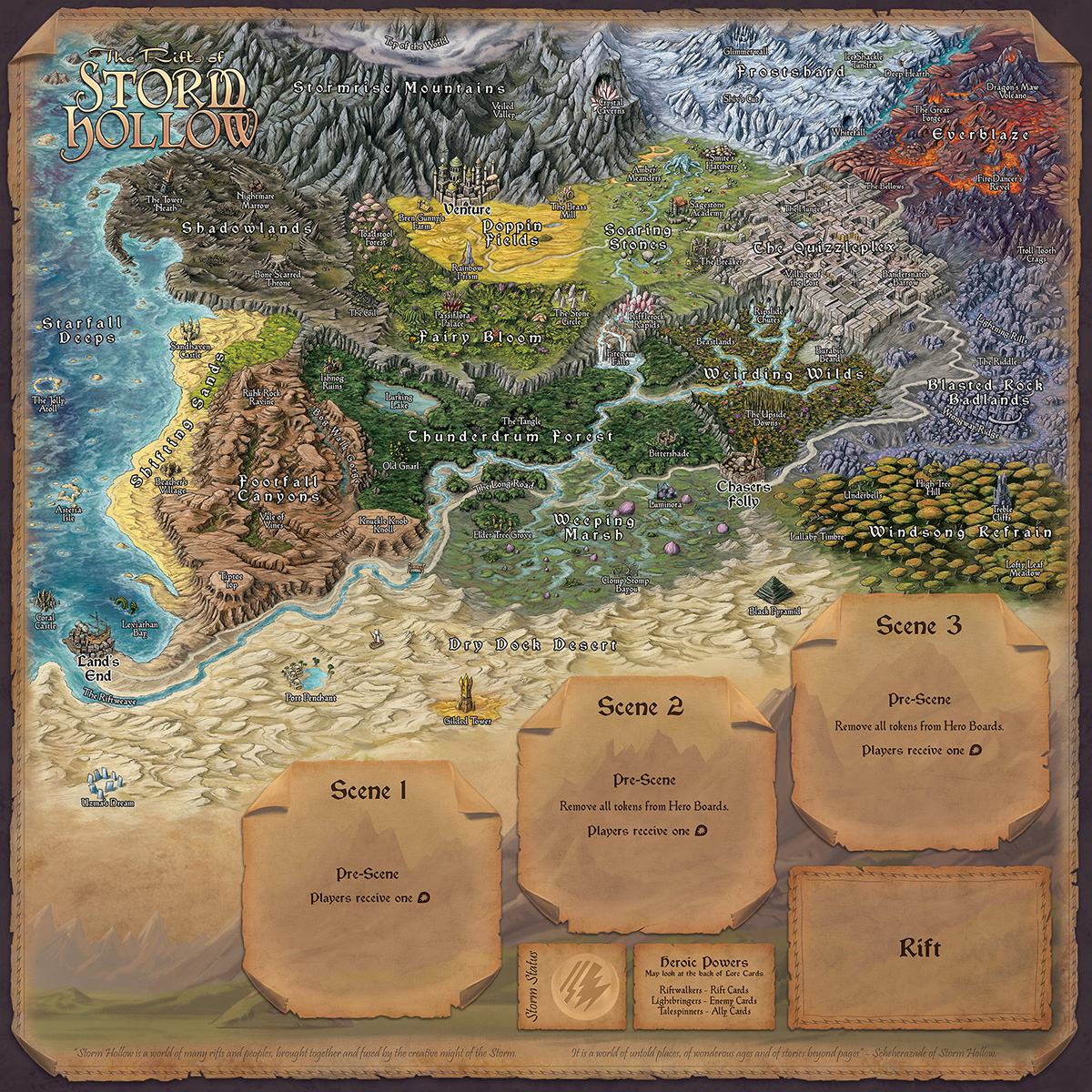
Around the same time Herwin and I did the labeling. We tried a lot of different fonts, and ended up modifying a couple slightly to suit us. Herwin straightened out and systematized the way we laid out the text, which neatened things up a lot. We tried Rift text that curved about, was stretched out, and eventually came back to straight labels for the rifts. Because of the planning early on in the map layout, all the labels avoided folds and cuts in the board. I was happy when Herwin asked me after working on the labels… “Hey, did you plan all the landmarks to avoid the folds?” We can’t always plan for everything in the process of making up a game, but it’s satisfying when planning pays off.
Herwin did the border for the map inspired by the card holders I’d placed over the map. The faint mountain image in the background was one I did late in the piece. For a long time Escapade and I has been talking about the Storyboard and how to lay it out. They had been very eager to see the scene card positions rising from scene to scene, a graphic depiction of the action rising. We’d talked about using a mountain or the like in back of the cards from early on, so I painted in something simple in the back along those lines.
Herwin’s work on this map was epic! He was fun, inspiring and easy to work with. Angie and Julian were equally epic in their attention to detail and imagination. At the time we were working hard to get it finished by the kickstarter launch and I think we just missed it by a few days if I recall. We did have a lot of other things to do… maybe I’ll write a journal entry about some of them… maybe when I’ve got more time, maybe when we’ve got the game on the shelves.